A Panel chart (also known as a trellis chart or small multiples) is a powerful tool in data visualization that allows for an effective comparison of multiple variables or categories. It arranges related charts side by side, making it easier to spot patterns, trends, and correlations within complex datasets.
Whether you are analyzing financial data, scientific research, or time series data, panel charts provide clarity and structure for comparison, making them essential in various fields.
In this comprehensive guide, we’ll dive into the definition, use cases, benefits, and how to create a panel chart effectively using popular tools like Excel, Python, and R.
What is a Panel Chart?

A Panel chart is a data visualization method that displays multiple similar charts in a grid layout. Each chart (or panel) represents a different subset of data, with consistent axes and scales, making it easy to compare different categories or variables at a glance.
This visualization technique is particularly useful when you need to examine several related datasets simultaneously.
Key Features of Panel Charts
- Multiple Subplots: Panel-charts consist of several smaller plots or graphs, all using the same axis structure.
- Consistency: Each chart in the panel shares the same scaling, which ensures consistency when comparing different datasets.
- Efficient Data Comparison: By placing multiple data sets in a single view, panel-charts make it easy to compare trends, patterns, and relationships.
How Panel Charts are Used
Panel-charts have wide applications across different domains. Here are a few examples:
Finance
Panel charts are widely used in financial analysis. Investors and analysts often compare the performance of multiple stocks or funds over time.
A panel-chart displaying different stocks or mutual funds side by side can quickly reveal trends, fluctuations, and correlations, aiding in better decision-making.
Time Series Analysis
In time series analysis, panel-charts are used to display the same type of data over different time periods. For instance, you might compare monthly sales performance across different regions. Each panel would represent the sales data for one region, allowing for easy comparison.
Scientific Research
Panel-charts are useful in scientific research to compare experimental results across different groups or conditions.
For example, in medical research, you might use panel-charts to compare the results of different treatment groups side by side.
Market and Product Analysis
Companies use panel-charts to analyze product performance across different markets or customer segments. For instance, a company might compare sales figures for different products in multiple countries, helping them identify where each product is performing best.
Benefits of Using Panel Charts
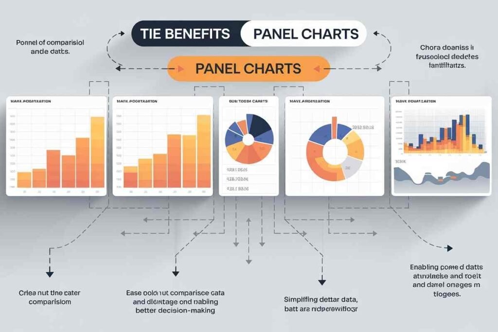
Here’s a concise breakdown of the benefits of using panel-charts
Clarity and Simplicity
Panel-charts help break down complex datasets into simpler, smaller components. Each panel in the chart represents a subset of the data, making it easier to spot trends without overwhelming the viewer.
Improved Comparisons
By aligning multiple datasets using the same axes and scale, panel-charts make it much easier to draw comparisons between variables. This is especially valuable when analyzing multivariate data or comparing performance across different categories.
Increased Efficiency
A panel-chart consolidates multiple graphs into one visualization, making it more efficient than creating separate individual charts for each dataset. This approach is ideal for comparing large datasets in a compact format.
Easy Spotting of Trends and Patterns
With panel-charts, you can quickly spot trends, correlations, and outliers across multiple data sets. This is particularly useful in scenarios like financial analysis, where identifying trends quickly is crucial.
How to Create a Panel Chart
Creating a panel-chart might seem complicated, but with the right tools and techniques, it can be done relatively easily. Here’s how to create one using some popular platforms.
Creating a Panel Chart in Excel
In Excel, you can create a panel-chart by combining multiple charts into a grid. Here’s how:
- Prepare your data: Organize your data into categories or variables.
- Create a chart for each subset: Use Excel’s charting features to create a chart for each subset of your data.
- Align the charts: Manually align the charts side by side, ensuring they share the same axes and scaling.
- Format for consistency: Make sure the formatting (such as colors, labels, and gridlines) is consistent across all charts for easy comparison.
Table: Example of a Financial Panel Chart in Excel
| Year | Department A | Department B | Department C |
|---|---|---|---|
| 2020 | $500,000 | $450,000 | $300,000 |
| 2021 | $550,000 | $480,000 | $350,000 |
| 2022 | $600,000 | $510,000 | $400,000 |
This table can be visualized in a panel-chart format to compare financial performance across different departments.
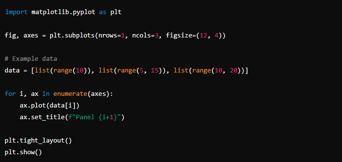
Panel Chart in Python (Matplotlib and Seaborn)
In Python, libraries such as Matplotlib and Seaborn allow you to create panel-charts using the subplot feature. Here’s an example of how you can do it
Panel Chart in R (ggplot2)
In R, the ggplot2 package supports creating panel-charts using the facet_wrap() or facet_grid() functions. Here’s an example
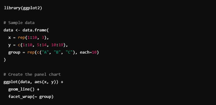
This will create a panel chart with three subplots for groups A, B, and C, allowing for easy comparison.
Best Practices for Panel Charts
- Consistent Axes: Ensure all panels share the same axes, so viewers can accurately compare the data across different groups.
- Keep it Simple: Don’t overcrowd the panels with too much information. Each panel should represent one set of data clearly.
- Highlight Key Points: Use labels, gridlines, and annotations to highlight key data points or trends in the panel-chart.
- Label Properly: Ensure each panel is clearly labeled to avoid confusion and improve readability.
Conclusion
Panel charts are an essential tool in data visualization, providing an efficient and clear method for comparing large datasets across multiple categories.
Whether you are working in finance, scientific research, or business analytics, a panel chart allows you to break down complex data and spot trends with ease.
By mastering how to create and interpret panel-charts, you can enhance your data-driven decision-making and make more informed choices.
If you want to improve your data analysis and visualization skills, learning how to create panel-charts in tools like Excel, Python, and R is a valuable skill. Following the best practices mentioned here will help you present your data in a way that is both visually appealing and easy to understand.
FAQS
What is a Panel Chart?
A panel chart is a data visualization tool that displays multiple charts side by side, using the same axes, to compare different datasets easily.
How Do I Create a Panel Chart in Excel?
To create a panel-chart in Excel, arrange your data, create individual charts for each subset, and align them in a grid, ensuring consistent axes across all charts.
Can Panel Charts Handle Large Datasets?
Yes, panel-charts are great for visualizing large datasets by breaking them into smaller, manageable parts for easier analysis.
What Are the Key Advantages of Panel Charts?
Panel-charts simplify data, provide clear comparisons, and highlight trends or anomalies while saving space by consolidating multiple charts.
In Which Industries Are Panel Charts Most Useful?
Panel-charts are widely used in finance, research, and business analytics for comparing datasets like stock performance or product sales.
What’s the Difference Between a Panel Chart and a Regular Chart?
A panel-chart displays multiple datasets in a grid for easy comparison, while a regular chart focuses on just one dataset.
Are Panel Charts Hard to Create?
Creating panel-charts in Excel can be tricky, but with practice, it becomes easier. It requires creating and aligning multiple charts.
Can Panel Charts Be Used for Time Series Data?
Yes, panel-charts are excellent for visualizing time series data, allowing for easy comparison of trends across different categories over time.